Background:
The ticketing page on 911memorial.org is the most viewed page on the website and the driver of 85% of their revenue. The website was redesigned in 2019 but the ticketing page wasn’t a part of that redesign. Since the launch of the ticketing page, many new offerings have been added.
Objectives and Goals:
Propose an approach that is lean, simple and realistic and maximizes sales on 911memorial.org’s most viewed page.
- Improve overall UX
- Increase ticket conversion flow
- Generate more awareness and revenue
Ultimately, to deliver a redesigned ticketing page that is modern, more useful, and better showcases the offerings, while focusing on the priority / highest revenue drivers; Museum tickets and tours.
Challenges:
- 4-week scope from kickoff to delivery.
- Recommendations to the ticking page itself are all that’s in scope, not any of the checkout flows.
Approach:
I developed an approach that allowed my team to deliver a high value within a short timeframe; a redesigned page backed by research and data analysis.

Foundational Work:
I kicked off the project with a stakeholder interview session to uncover the pain points of the current experience and to learn about the client’s vision for the ticketing page in the future. Next, I did a UX audit of the current experience and reviewed the website’s analytics to identify gaps. I also conducted secondary market research to better understand ticketing best practices and to learn from industry leaders.

Wireframes:
I used Figma to create wireframes, taking into consideration insights from the stakeholder interviews and secondary research and outputting both desktop and mobile mockups. I met with the development team to validate my designs from a technical perspective. I also made some minor recommendations to other areas of the website with user flows leading to or from the ticketing page – the client loved this!
Final Designs:
I created mockups in Figma based on my wireframes and initial feedback from the client. Then I worked with a UI designer to make them more high fidelity and create the illustrations we recommended adding to the page.
The changes I recommended that I expect to be the most impactful are:
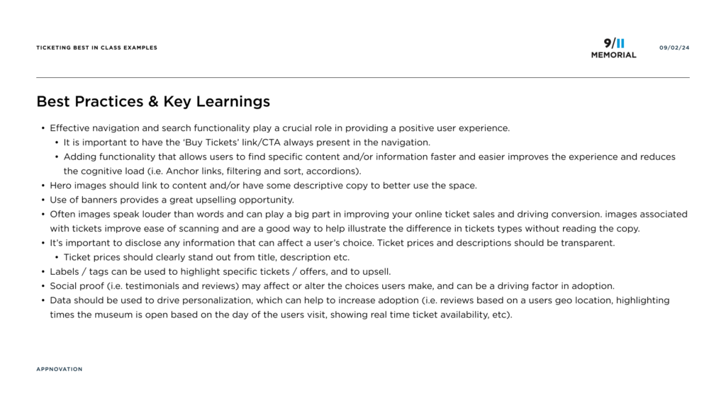
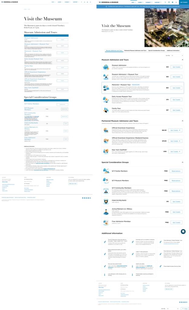
- Addition of a hero image for visual interest and to create more consistency across the site
- Addition anchor links for easier navigation
- Improved ticket layouts so pricing is clear
Original design on the left and redesigned page on the right.

Results & Next Steps:
The client was thrilled with the final designs and they believe the changes I suggested will have a large impact on the usability and experience of this page. They loved the illustrations so much that they are considering using them in the museum and in print.
The page is currently in development, so I haven’t been able to track the impact of the changes yet. However, I’ve developed an analytics plan utilizing GA4 to track events and KPIs such as conversation rate, average session duration, use of the sort by option, and CrazyEgg to track and understand user behaviour.
